Beautycounter Kids:
Branding & Packaging
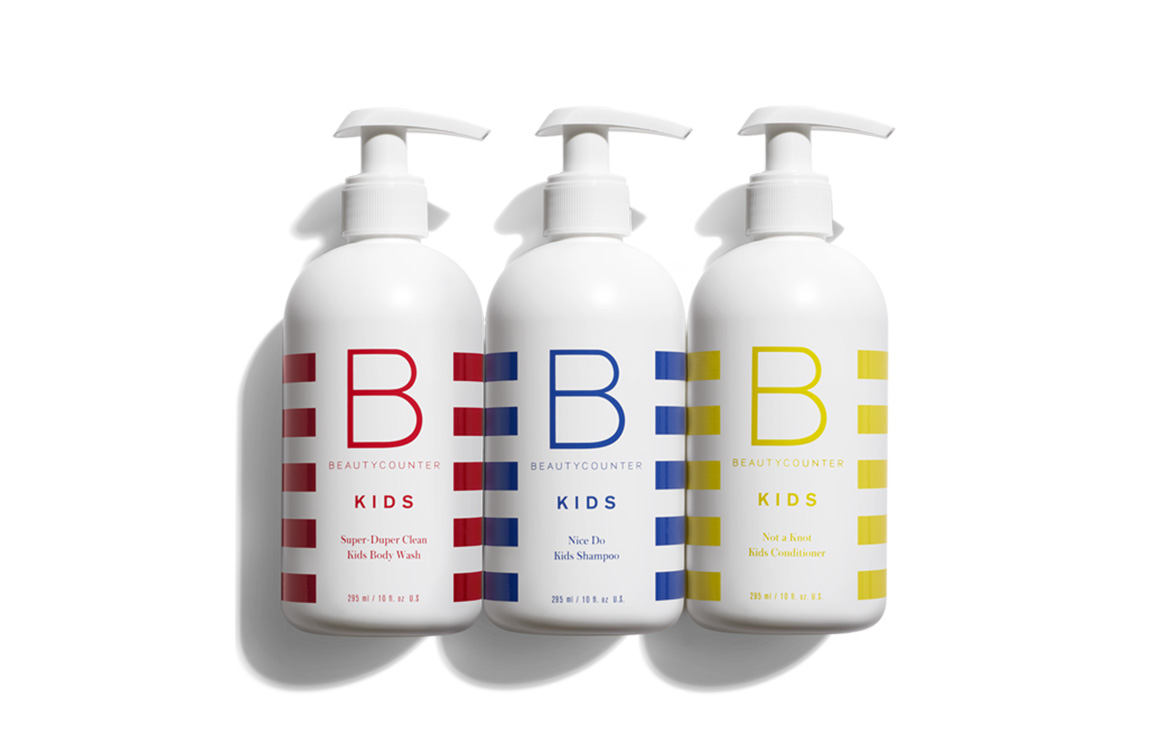
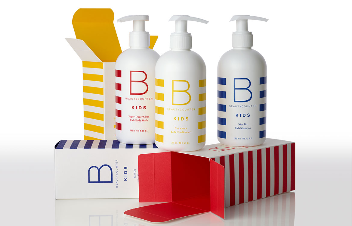
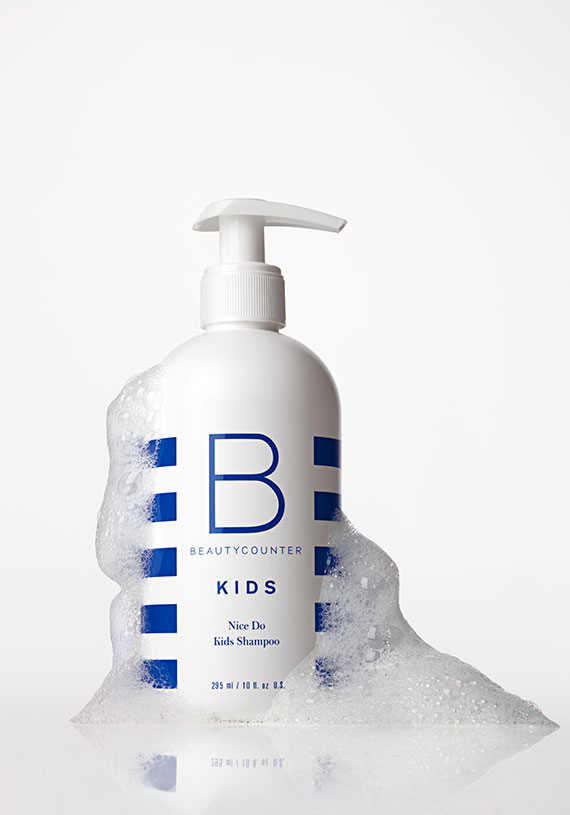
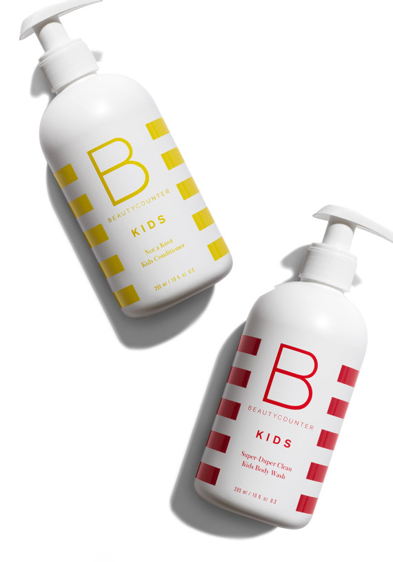
Kids rebrand and packaging design for the North American market and Canadian market launch. The design speaks to the brand’s philosophy of simple yet rich, beautiful and pure products that are safe for your skin and protect the environment. The stripes highlight a core brand equity and the primary colours play on the simplicity and whimsy of childhood… Red, yellow, blue like A, B, C!
Credits
creative direction, don florence and natalia del rivero
design and production, natalia del rivero
photography, mark laita